Wednesday, August 19, 2009

Occasionally... The Process Does Go Awry!!


This is Rudy. Normally, when I am contacted by a potential client, we go over whether there are any elements/scenarios they might like to see in a poster. Occasionally, I will try to come up with something on my own to get the ball rolling. Occasionally... the wheels come right off the apple cart. This is my "train wreck" poster... an original idea that the client just didn't like... and was trying REALLY hard not to hurt my feelings! Take a look at the file that went to the printers (the second image where Rudy is hovering gently over a field of daisies) and the one I originally sent to this client (a poster with a very different feel)...Hard to believe that these two posters were designed for the same client! The point is that we eventually ended up on the same page. LOL.

Tuesday, August 11, 2009

Same Dog... Different Feel


Since the "clip art" bulldog in the last entry turned out ok, I figured I'd try and use a style of coloring that is a little more reminiscent of my usual style in Illustrator. Here he is.

Sunday, August 9, 2009

From Long and Lean... to Stout and Mean!


I'm always looking for opportunities to expand my experiences in Adobe Illustrator and, when I found a website that allows you to submit designs for t-shirts, posters and logos, I decided to join. Despite a constant influx of open competitions through this site, I am looking primarily for opportunities to designs products that include dogs or other animals. When I found an open competition to design a t-shirt for a football team called the "bulldawgs", I decided to give it a try. Bulldogs are so different from the long lines of greyhounds, that I initially had a little trouble. After downloading a photograph of a bulldog, I was able to put together the first image (hand drawn - not clip art). This particular bulldog represents a slightly different style for me. I almost never outline my images in black (a little too harsh for my tastes), but I was pretty happy with how this one came out. However, after some amount of playing around, the designs I eventually submitted looked quite different from the original dog.

The client also wanted a pair of angel's wings in the design. About a year ago, I found an online tutorial about designing wings in Illustrator. I finally got to use them! My submitted design (one of roughly a dozen) is being decided upon as I write this. Wish me luck!

Saturday, July 4, 2009

GreyFellas: FINAL!


Here's the final product! All the characters and text have been arranged, and the client's ferret, Whizz, has been added....because what would a gangster-style poster be without a weasel?

GreyFellas: Jazz


While the vast majority of my experience in Illustrator has been with Greyhounds, I am always willing to try other breeds of dog! Here's the lovely Jazz.

GreyFellas: Ranger


Here's Ranger!

GreyFellas: Murphy


Next up is Murphy.

GreyFellas: Maui


These days, before I put an entire poster together, I will send the client files of their pets so that they can be approved. At this stage, alterations to markings, facial expressions (and anything else), can be done easily. It's always easier to alter these things before all the elements are brought into a final poster. The next few posts are about a poster called GreyFellas. The clients had plenty of ideas and feedback, and the process was a lot of fun! The final composition of this one, although similar to the "Farm Poster," has a very different feel. Hopefully, these kinds of posts will spark some kind of inspiration. :)

First up is Maui!

Monday, June 15, 2009

This blog is NOT for family pictures... I repeat...


When I started up this blog, I was determined that its primary (only) focus was going to be my website and my art. However, over the past week or so, I find myself consumed with something other than my day job or my website. Late last week, our first child made her way into the world. My pregnancy has been both physically and emotionally difficult, but she was worth every minute of it! For those of you who ended up waiting slightly longer for your posters over the past few months... here's your reason! :)

So, this time around, there won't be any art to post - only a short timeline of the hours leading up to our daughter's birth.

TOP PANEL - 24hrs to go. My husband, Lewis, and I head out to the park with our greyhounds for one last pre-baby stroll and some ice cream.

MIDDLE PANEL - 2.5 hrs to go. My hospital bag is packed and we are headed to the hospital for my scheduled c-section. Here I am telling my boy Jack to behave.

BOTTOM PANEL - Our little girl, Naomi Grace Kavanagh, was born at 1:43pm on Thursday, June 11, 2009. She weighed in at 7 lbs, 4oz and she is absolutely lovely. Her father is doomed!

Tuesday, June 9, 2009

Brewsters!


In addition to putting together custom work, I also create what I call semi-custom posters. These are based on bar posters that I originally created for my own enjoyment. Here, the color of the dog and text on the poster is changed out to reflect your own dog. The result is a less expensive product that (usually) takes considerably less time to put together.

Above, Kipper has been incorporated into an existing poster template to create Brewsters!

Monday, June 8, 2009

Farm Poster: 80 Greyt Acres!


These clients live out on a farm with several adopted greyhounds, horses and donkeys. As they continued to send me images throughout the process, I became more and more jealous! The lifestyle sounds like a dream. Anyway, here's last file that went off to the printers!

Sunday, June 7, 2009

Farm Poster: Part 6


Finishing the body of the horse below (Sunny) became a little bit of an issue. This little guy (Poncho) was much easier for me to put together in Illustrator. Go figure.

Saturday, March 28, 2009

Farm Poster: Part 5 - "Do you draw horses and donkeys?"


Apparently the answer to this question is yes... Yes I do.

Friday, March 27, 2009

Farm Poster: Part 4


Next up is Ellie! Phew!

Farm Poster: Part 3


Next on the list is Leah. In the accompanying picture, she's on the right.

Friday, March 20, 2009

Farm Poster: Part 2


Next up in this farm compilation is Nigel!

Farm Poster: Part 1


So, I thought it would be fun to post progress reports on some of the commissioned work that I do. This poster will eventually have at least four greyhounds and maybe a donkey and a horse thrown into the mix. I've decided to post these hounds as I finish them individually. First up is Hubbel!

Thursday, March 12, 2009

Here's the Finished Product!


I'm still learning to use sketches and work over top of them in Illustrator. This dog is based on a picture I found of Disney's Bolt. I've tried to angle the head upward a little, but it seems to have taken away from that trademark greyhound "needle nose." Sigh.

Based On a Picture of Disney's Bolt.

Monday, March 2, 2009

There is no such thing as "JackJack's"


When I started my website couple of years ago, I was primarily designing fictional pub posters. I call it bar art. Don't ask... and don't bother trying to analyze it. There isn't any sense to be made here.

Sunday, March 1, 2009

Our boy, Stuey


Still hanging out on my weekend off. Here's our boy, Stu. His neck's a little exaggerated. Oh well...

Sunday, February 15, 2009

The Many Faces of Dave


Using a similar structure to the black greyhound below, this is my dog Dave. The illustration is more simple in nature.

Tuesday, February 3, 2009

Image Recycling


Take a look at my previous "logo blog," and you might notice something vaguely familiar about the dog. This poster (not for sale), was something I created a few months ago. The featured dog was borrowed from the created logo. Since the logo was designed specifically for a paying client, I won't be using the dog in any other poster or item I offer for sale. This poster was shamelessly created for my unborn child. My husband and I are expecting our first child in June and, until she is old enough to tell me to kindly remove the poster, it will hang in her nursery. Contact me at: info@posterhoundz.com if you might like something similar for your new little one.

Sunday, February 1, 2009

Need a Logo for Your Dog-Themed Business?


I really do enjoy creating logos for various dog-related events/businesses. While some clients have absolutely no idea exactly what they want, many at least have some kind of starting point. You might have certain colors in mind, or a specific feel that you're after. Even if you don't, I can come up with a few ideas to get the ball rolling.


I generally have a couple of rules when I create logos. I do try to keep the logo fairly simple. Even if there's an illustration of a dog in it somewhere, I will always provide you with dog-less versions, and versions for both black and white backgrounds. These often work better on stationary, business cards, forum signatures, etc.


I will provide you with as many images as you need, in as many different versions as you desire (ai, jpg, png, pdf, etc). I always tell clients that if they ever find they want an image scaled up or down, to please contact me. Even if I finished your logo a year ago, you are always encouraged to contact me if you need anything done to it. Trust me. It will always be easier for me to pull up an old image in Illustrator and scale it up or down for you, than for you to try to do it on your own. It will only take a few minutes, and it will look much better in the long run.


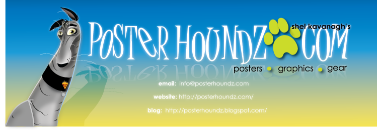
Above is an example of a logo I created a couple of years ago. The client knew that she wanted an edgy feel to her logo, and she knew she wanted cool colors in it like gray, green and blue. Frankly, this is more information than I'd normally get to start with, but it didn't make creating her logo any less challenging. Even with all this starting information, I had a fairly rough time coming up with an original idea. The easiest place to start is usually with the text (remember, there will be a dog somewhere in the final version). Because she wanted something edgy, I had originally thought of using some kind of graffiti font, but there's a problem with this. Many of these kinds of fonts are barely legible, and nothing stirs up confusion for a potential customer like a logo they can't read. The next best thing? To use a readable font that would allow me to layer colors on it to make it look a little like graffiti. The font I chose here is called "Wicked Queen." By layering this text in the client's chosen colors, you end up with something that has a little dimension to it. Pictured is the original starting draft and the final completed text the client agreed to.


Creating the image of the dog to go with it was actually more challenging than the text itself. Because I wanted a very simple dog illustration, I figured (incorrectly) that I could simply whip up something directly in Illustrator. In many instances these days, I don't have to resort to a sketch first. However, after spending way too much time trying to pull something together, I shut down my computer, and in minutes, came up with the sketch and final version of the dog pictured above.


The client was happy with the final version, but requested to see the logo in another color scheme she liked. The last two images represent the version that she chose (in gray, green and blue) and a similar logo in chocolate brown and blue. You can see how simply changing out a few colors can completely change the feel of the logo, so choose your colors carefully!


If you are interested in a logo for your dog-related organization or business, please contact me at: info@posterhoundz.com for details.


Monday, January 26, 2009

DONATIONS! The end of January is upon us, and the requests have started coming in!


Last year, I had the pleasure of donating posters for a variety of events and fundraisers. If you're interested in a donation in 2009, there are a couple of things you need to keep in mind. The more time you give me to get something together for you, the better - at least one month if you are within Canada, and at least two months if you are contacting me from the U.S. There is always the risk that an item may get held up at customs. This is almost never an issue, but it does happen. I will need the name of your organization (and website), the date by which you need the item, and an address where I can ship it. Since I will inform you when an item has been shipped, I also kindly ask that you inform me when it has been received. It may not sound like much, but I can assure you that a request for a donation followed by... nothing... will result in my respectfully declining future requests. A little courtesy is appreciated.

If you would like a donation for your rescue/adoption group, please contact me at: info@posterhoundz.com. I wish you all the best with your fundraising efforts in 2009!